MY BLOGS
Nat Blog


May 2011
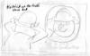
Now that I know what is going on every page it's time to make some decisions about the format of the book e.g. what size it will be. There are certain set formats which publishers use - this is based on costs; all the pages are cut from large sheets and it makes good business sense to choose a size which can be cut from this source with as little wastage as possible. My editor Sue and I choose a size which is roughly 24cm wide by 27cm deep.
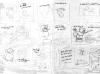
Next we need to think about what typeface to set the book in. Typefaces are a crucial element in the design of a picture book; they must compliment the illustrations as well as be compatible with the tone and feel of the story. For example an uptight, stiff typeface like Times New Roman, which is perfect for a serious newspaper, would be totally incompatible with the light, fun feel of my story. However there is also a traditional feel to this project and so something too modern and funky would not be appropriate either. Sue, myself and Clare, (a designer at Random House who will be working on my books) decide on a face called Bembo MT Schoolbook (see illustration below) as a working typeface. Now that I’ve got a provisional page size and typeface I can start creating an early version of what the finished book will look like. I cut up the printed out text in blocks and start sticking it onto the pages. This could of course be all done on the computer but at this stage everything is still changing and it’s much quicker to lift and move a bit of paper than to keep printing out different versions of the pages (Also, you can imagine the waste that would be involved in doing this for 32 pages!)
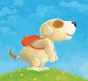
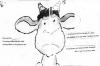
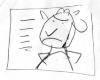
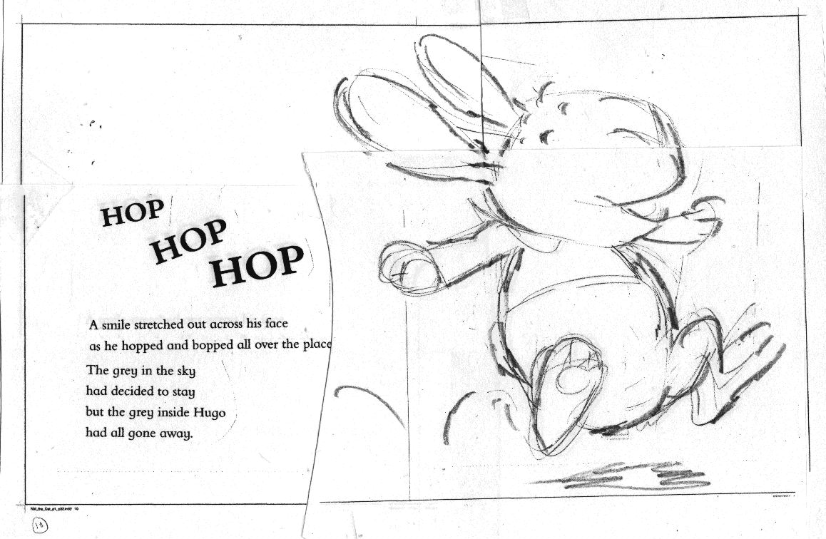
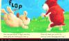
With the type stuck down I now have a sense of what space is left for the illustrations on each page. As I sketch them out, many of them fit comfortably but then I hit a problem. There is a spread which shows Hugo Hare hopping in the air and thanks to his long ears he is not fitting comfortably on the page at all. The only way I can squeeze Hugo in is by having him close to the ground with ears angled horizontally. These constrictions conflict with the Hugo’s feeling of joy which the hopping action is representing. It’s a strange claustrophobic feeling - you know what you want to achieve but the limits of the page size are making you compromise your vision of it and in the end this can mean only one thing: the format is not right for the book. Hugo needs more height to hop in and if he needs more space you can be sure there will be other characters who need it as well.
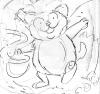
At my next meeting with Sue and Clare I explain my predicament and together we decide on a taller format. Hugo is now able to hop freely without hitting his head and I feel able to move forward!
NEW ON THE SITE

HAVE YOU SEEN?