MY BLOGS
Nat Blog


September 2011
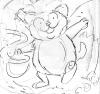
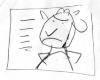
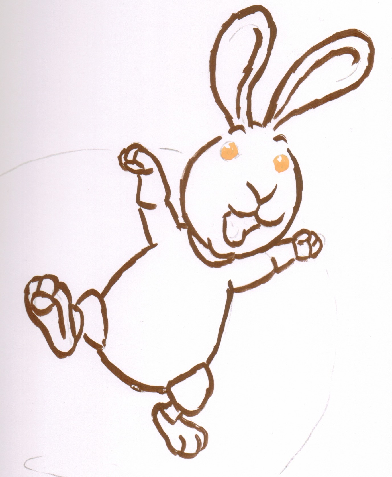 Here is my attempt at painting Hugo. As you can see I start with the outline which, in its varying thickness, demonstrates the character you get with a brush-painted line. But unlike the black and white line drawings I showed in The Line that is a Lie this one is not a finished piece; it is just the first step on the way to completion because it is waiting for the addition of colour. An outline that is used with the accompaniment of colour is a very different thing; it doesn’t have to work in isolation to describe its subject - it works together with the colour to do that. Because of this, in a way, it doesn’t have to work so hard, it can fulfil its job of making the characters stand out on the page in a less flashy, and obvious way. It can even sink into the background so that you hardly know it’s there doing its job. Having said that, whatever line you paint still has its character and this will have its impact on the overall feel of the illustration, even if the viewer is not consciously aware of it.
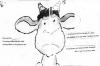
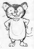
While playing around with paints a technique arises which I think provides a subtle look which will underpin the painted style nicely. If you look at this close up of Hugo's ear, which has been coloured in, I can explain what I found. Do you remember when you were at school and ‘good colouring in‘ meant not going over the lines? Well in the adult world such rules don’t apply! As I slapped in the brown colour I inadvertently went over the line a bit. This had the effect of slightly eroding the outline from the inside and gave it a raggedy, chaotic feel. This may not seem like much but when it is applied to the whole illustration it has a cumulative effect which, subtly, changes the feel of the whole painting.
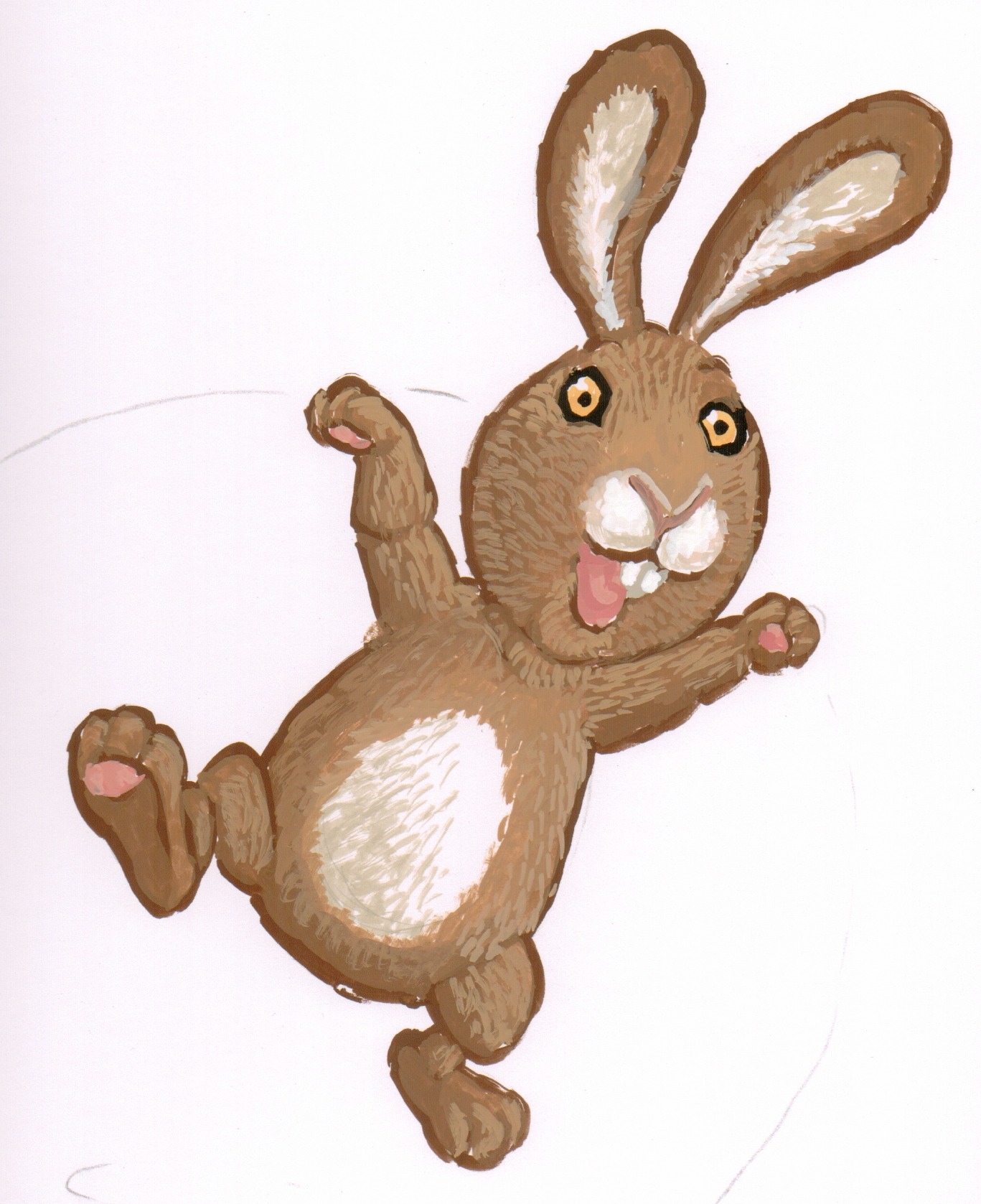
When background colours are applied the character's outline gets slightly eroded from the outside too and so the raggedy effect is compounded. Now that I have this basic technique to underpin the style of the artwork I feel ready to launch into the fine detail of working out the colours and brush techniques I will use in all the characters.
July 2011
NEW ON THE SITE


HAVE YOU SEEN?