MY BLOGS
Nat Blog


September 2011
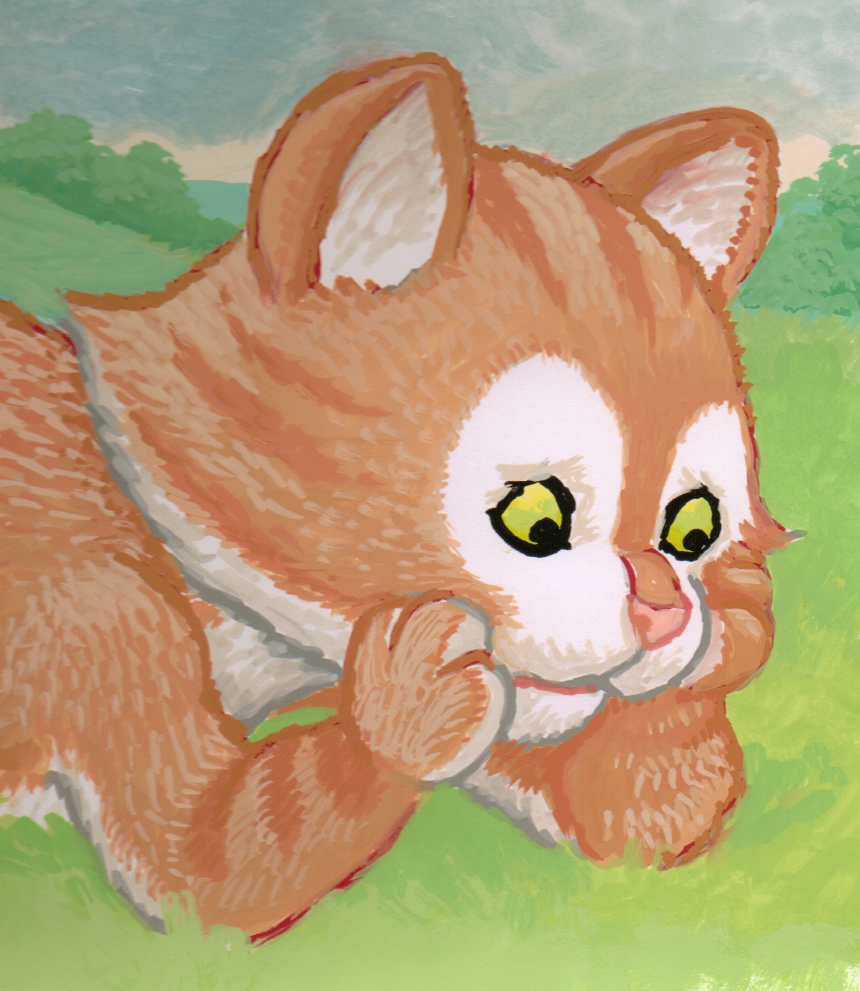
As Nat is a ginger cat I want something in the brown range for his outline colour – this will make the illustrations appear much softer than a black outline would. The line is the demarcation between Nat’s body colour and whatever is in the background and it needs to sit comfortably on the page. It has to be dark enough to do its job of making Nat stand out a bit from the background but not too dark so that it will dominate the other colours. I try a dark reddy brown called Chinese Orange. To see it in action I paint in Nat’s body and a rough backgrouund. The line looks good apart from where his coat becomes white and the line looks too heavy; I decide to use a l grey for these bits on his chin, belly, inner legs and arms. The ‘formula for this book is revealing itself to me; I now know for the other characters that the outline corresponds to whatever colour it is enclosing.
When I come back to the sketch the next day I am surprised to find that the reddy brown looks too dominant (you can see it under Nat’s forearm in the illustration). I am baffled by this because yesterday it had looked perfect. Whilst trying out the colour again I discover the answer to the riddle: the Chinese orange paint actually gets darker as it dries! I try using a yellow ochre and paint over the previous outline; it’s clear to see from the illustration above that this is a much more harmonious choice.
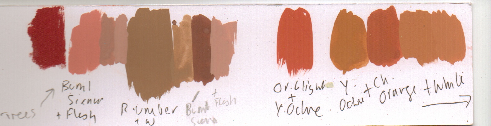
Next I must decide the outline colour of the other characters because they must all work together, doing their jobs of defining the character, reflecting their body colour whilst making them stand out to the right degree (as well as not dominating each other). As you can see, choosing the colours is an important job; one wrong choice can jeopardise the whole success of the end result you are striving for. After weeks of trial and error I end up with scribbled notes for every colour which goes into the characters; you may be surprised to know that each one has at least seven colours in them. All these are scribbled down so that I can reproduce the winning formula again.
July 2011
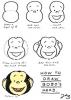
NEW ON THE SITE


HAVE YOU SEEN?