MY BLOGS
Nat Blog
May 2011
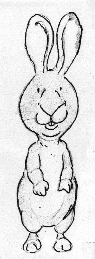
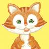
Working out how the characters look comes partly from writing - the more you try them out in different situations, the more you find out about how they would react and so you discover what their personalities are. For example, in the original Nat the Cat story it was very clear to me that Hugo would be the one to be sad because he is a sensitive character. This then gives him a certain role which is tested out and confirmed in the other story ideas that I have. As Hugo is the most vulnerable, I want to make him the smallest of the characters and this perhaps also makes him the cutest of the three.
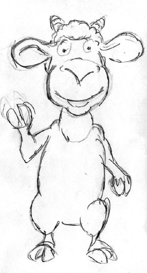 I already have a look for Billy from his appearance in Shhh! Duck Don’t Wake the Baby! (he was the baby ); now all I have to do was make him look a bit older.
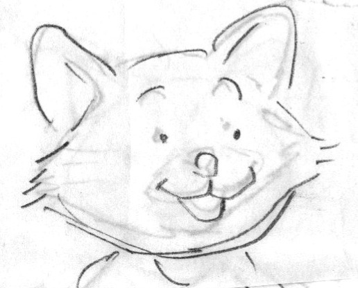
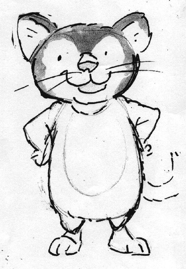 My editor is happy with my initial sketches for Billy and Hugo but not convinced by the drawing of Nat. If you look at the shape of Billy’s head you’ll see it is long and thin, while Hugo’s is bulbous like an onion. When I’d made the drawing I’d felt that I needed a quite different shape for Nat and a squashed circle seemed to be the answer; unfortunately it made Nat’s face look slightly bear-like. This simplification business is a tricky thing: you want to be bold and have a bit of style and yet, if you get it wrong, the style gets in the way of describing the animal you’re trying to capture thus defeating the object. After looking at some cat photos I have another attempt at Nat’s head, this time using more of a squashed diamond-like shape. Suddenly, with just a few different strokes of the pencil, Nat has magically developed more character and heart; he also looks younger, which suits the age of the story much better. As Sue and I look down at the sketch it's quite a special moment as it's the first time either of us has really ‘met’ Nat.
NEW ON THE SITE
HAVE YOU SEEN?

